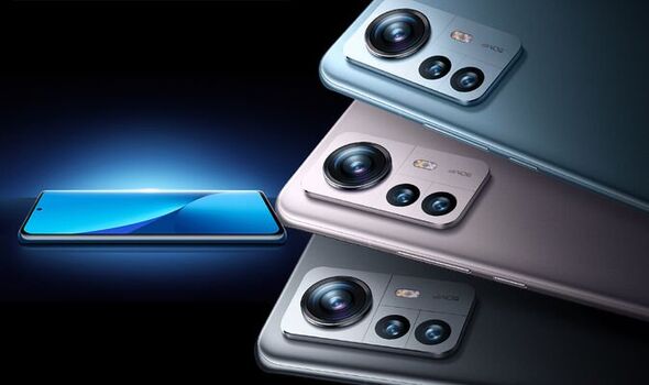
Many other companies have imitated Apple’s design language over the years, but Xiaomi has always been one of the worst. The Xiaomi 13 flagship continues the company’s tried-and-true strategy by adopting a design that, at first glance, could easily be mistaken for an iPhone.
The new Xiaomi 13 does not attempt to hide its source of inspiration. The device has a 6.36-inch display with a stainless steel finish and flat edges. Even the color of the device that appears in the majority of Xiamoi’s press photos is strikingly similar to the pacific blue finish that Apple used on the iPhone 13 Pro the year before.
A SIM card tray, speakers, and a USB-C charging port are all located on the device’s bottom. A triple-camera setup in the shape of a square that looks like Apple’s is on the device’s back, but it has a distracting “Leica” logo on it.
The back is the most significant feature that sets the Xiaomi 13 apart from Apple’s most recent iPhone design language. Xiaomi has chosen a design that is somewhat rounded and has a soft-touch finish. Naturally, Apple utilizes a flat glass design.
Xiaomi has repeatedly shown no remorse in cloning Apple’s designs, despite being frequently mocked. For instance, many people were quick to point out the many similarities between the iPad Pro and the Mi Pad 5 Pro last year.
Xiaomi CEO Lei Jun even acknowledged the company’s plans to “benchmark against Apple” in an interview this year, stating that competition in the high-end smartphone market should be viewed as “a war of life and death.” The company’s 2018 flagship smartphone looks nearly identical to the iPhone X.


